 |
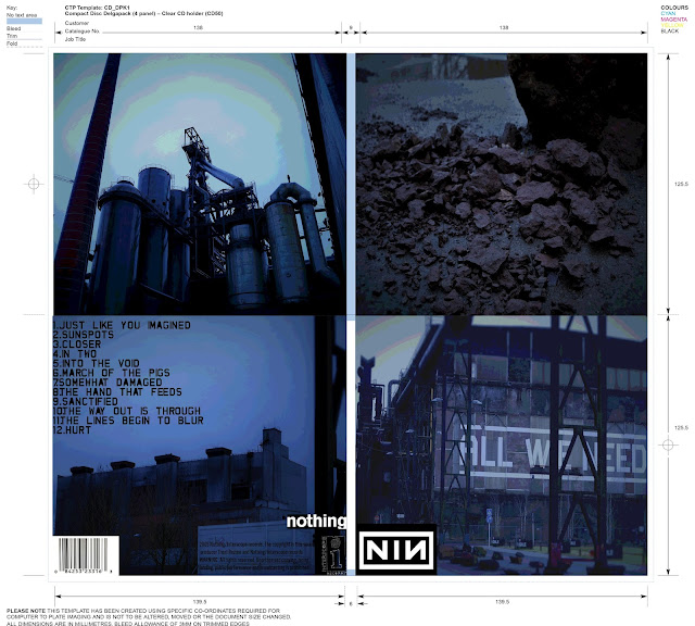
| Top left: Inner left. Top right: Inner right Bottom left: Back cover. Bottom right: Front cover. |
I will be gathering audience feedback to see what can be improved on and changed in due course.
My decision to use the blue tinted imagery was due to the influence of Rob Sheridan and his various works with Nine Inch Nails.Acompanying this overall colour was the NIN logo which is seen over most Nine Inch Nails releases. In addition to this I have placed all institutional information on the rear panel including the record labels, distributors and parent companies. Beside this I have placed a bar code for retail sales. For the track listing I have used the custom 'fragile' font as seen on 'The Fragile' album in 1999.
You should consider how best to better evidence technical (editing) skills. A lyric booklet is a typical means of doing this (and showcasing the artist, strengthening branding/links to video/website too) - given the wide range of imagery you have produced this would be advisable
ReplyDeleteno spine!
lens flare effect maybe not a good idea?
rear panel too dark?
need to look closer at what goes on the bottom of the rear panel
12 tracks, nothing specific/exclusive to digipak? maybe code for downloadable extras via website for example?
is this not a compilation? if so, wouldn't that be clearer?
inner panels could be used for a more complex composition - remember that they effectively flow so can be designed as a landscape image
you can represent the CD disc itself too - eg see http://www.katesmusicvideos.blogspot.lu/2014/03/complete-lyrics-booklet.html
Think carefully about how you can include the viral concept within this - makes for a more arresting inner panel design? QR code, URL/s, hashtags...?
justify/explain
ReplyDelete